bg3wiki:Image policy
| bg3.wiki sidebar |
|---|
 |
| Maintenance |
| Help |
| Policy |
| Manuals |
It is important to be use the correct file format and to follow the appropriate naming convention when uploading images to BG3Wiki.
Naming convention
Image names should be brief, concise and descriptive. They use the following format:
Prefix_name_suffix.fileformat.png/.webpcode
- Prefix
- A brief term that gives context to the image. When contextually applicable, it can be the primary category of the image.
- File name
- The file name is simply the name of the image. More specific guidelines can be found under the appropriate sections.
- Suffix
- Added when further classification of needed, and can be a single word or an abbreviation.
The following image names use a Prefix_Page_name_Suffix format:
- Underdark_Sussur_Tree.png
- Underdark_Mushrooms.png
- Underdark_Mush_Bibberbang.png
- Underdark_Arcane_Tower_NE.png
- Underdark_Arcane_Tower_S.png
Items and objects
Includes in-game items and objects.
- Faded images, 380x380
- Prefix_Itemname_Faded.png/.webp
- Unfaded images, 144x144
- Prefix_Itemname_Unfaded.png/.webp
- Unfaded images, 64x64
- Prefix_Itemname_Unfaded_Icon.png/.webp
The Prefix is usually the category of the item, and does not need to be included when it is unnecessary or the item or object lacks any specific category.
In cases where an item or object has multiple image variations, distinguish them by using a single letter following the item name:
- Backpack_A_Unfaded_Icon.png
- Backpack_B_Unfaded_Icon.png
When multiple items or objects share the same in-game image, only one file should be uploaded. Instead of uploading duplicate images, create Redirects to that image using the same naming conventions as above, corresponding to each item using that image.
Game mechanics
Includes spells, actions, abilities, conditions, passive features, and feats.
- Large faded images
- Page_Name.webp
- Small unfaded icons
- Transparent background
- Page_Name_Icon.webp
- Opaque background
- Page_Name_Condition_Icon.webp
- Transparent background
In game photography
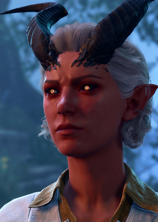
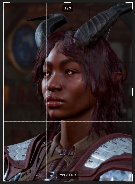
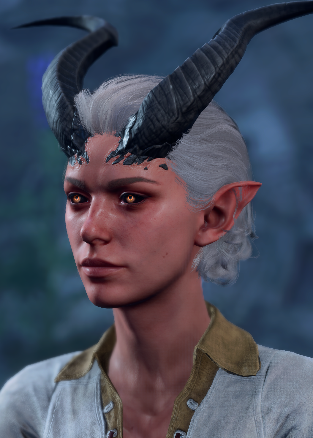
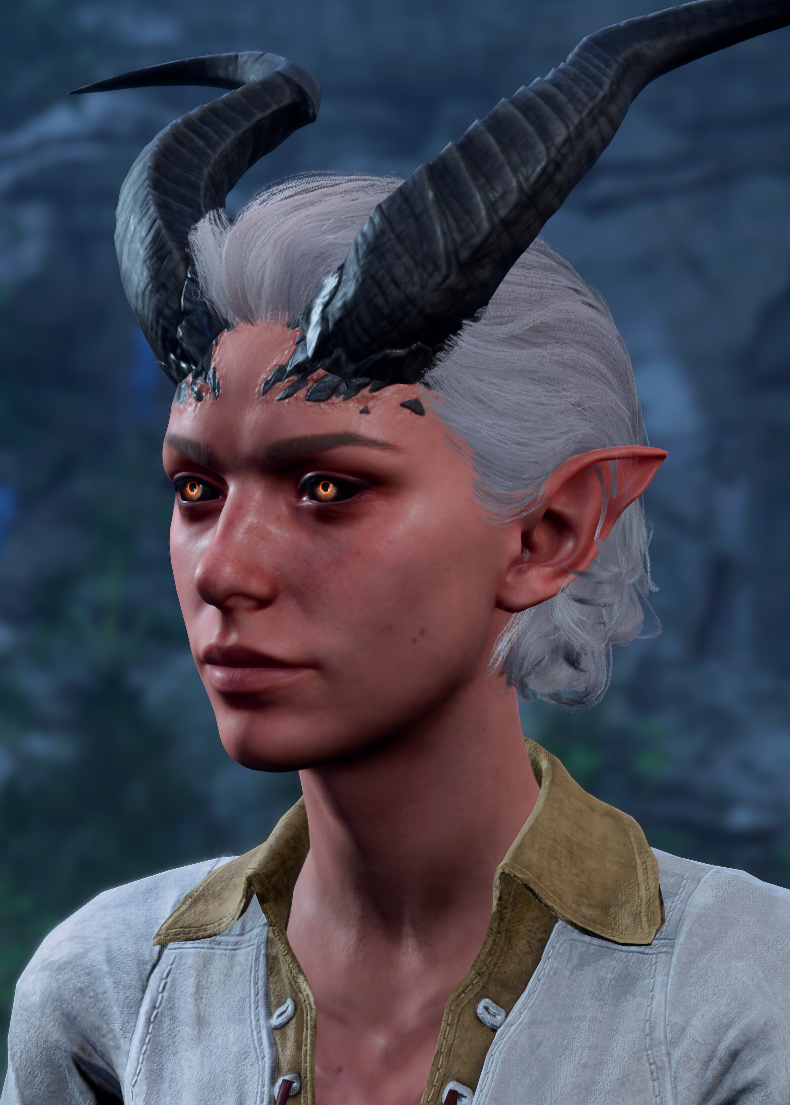
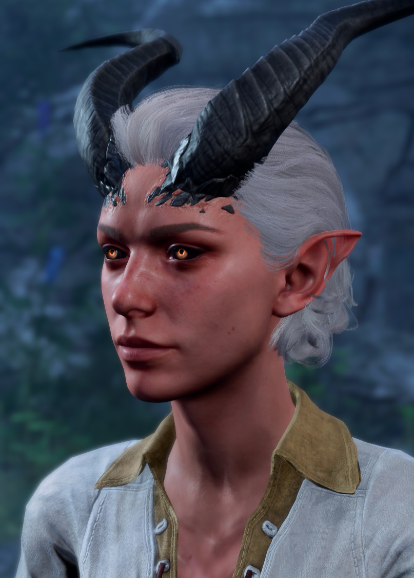
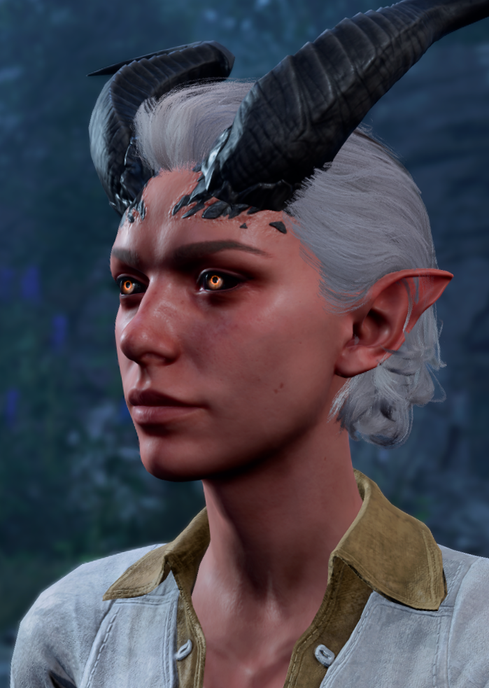
This section is targeted towards generating images for the in game parameter of {{Infobox creature}} infoboxes, but its principals are generally applicable. Capturing from cutscenes and dialogues using the in-game photo-mode where possible is preferred. It is the most faithful representation of the player's view, provides inherent standardization, and is already tuned by Larian for a cinematic feel. Photo-mode is preferred over a straight screenshot for improved lighting, specifically from closeups, as the waist up angles are unlikely to retain enough resolution after cropping (ideally at least 500 x 700 px). Even so, these captures can sometimes be somewhat dark, and should adjusted where possible. When cropping, aim for a 5:7 or 4:5  , and refer to the for framing. Search engines crop to the center and as of writing the wiki's preview biases high. Cerys' portrait below is a good example of the desired result.
Using photo-mode manually
If capturing from dialogue or cut scenes proves infeasible or yields undesirable results:
- Enable effects to blur the background relative to the subject. This draws the viewer's attention to the character.
- The character should be looking slightly stage right,[1] and be captured from at or below eye level
- Assume an of f/22.0 (as low as photo mode will go).
- Use as low a as practical without blurring the background beyond recognition. Do not exceed 35° as this begins to produce a fish-eye effect.
Examples
-
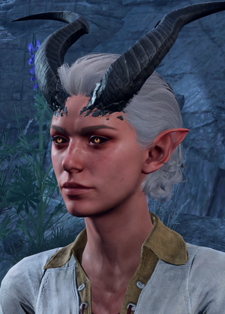 10° (no depth of field)
 -
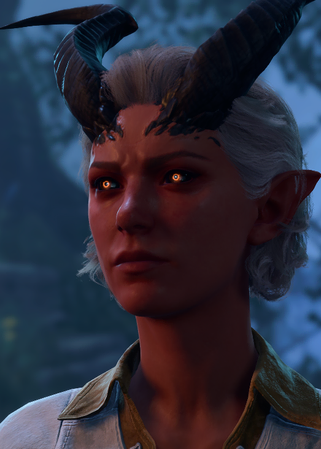 Raw Dialogue Capture
 -
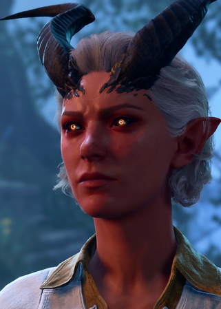 Processed Dialogue Capture
 -
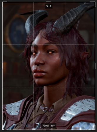 Rule of thirds
 -
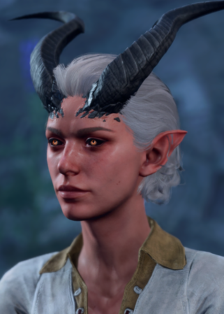 10°
10° -
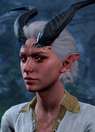 25°
25° -
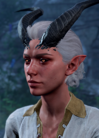 30°
30° -
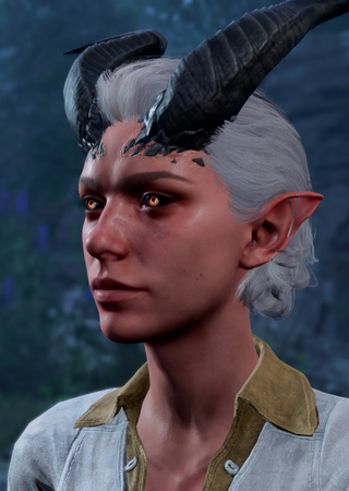 40°
40°


Graphics Settings
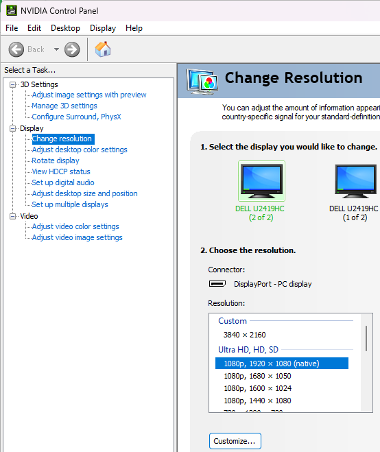
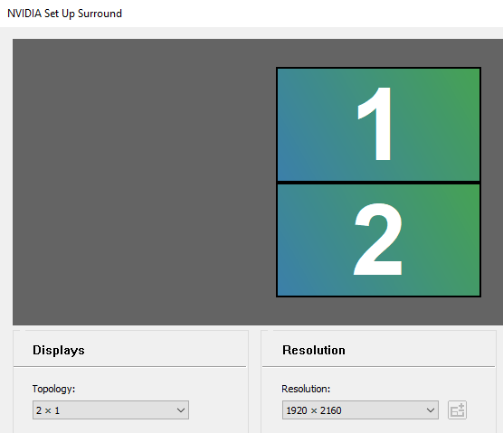
Regardless of capture method, aim for as high a resolution and visual settings as possible. Enable Anisotropic filtering directly in your graphics card's control panel. Depending on your hardware it may be possible to force the game to render at a higher resolution than your monitor supports, or combine multiple monitors to a single virtual one. This is not recommended for gameplay, but can enable captures at higher resolution than would otherwise be possible. While the wiki doesn't need everything at 3840 x 2160 px, it grants headroom to crop.
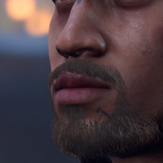
-
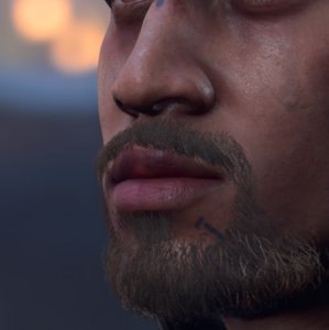 Anisotropic filtering enabled
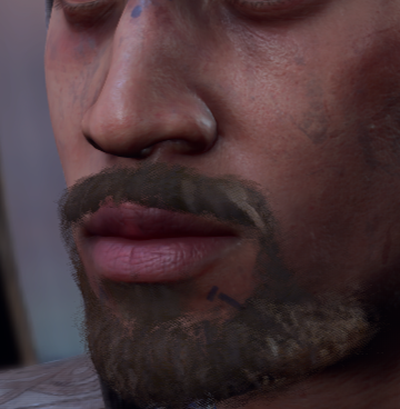
 -
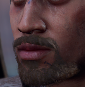 Anisotropic filtering disabled
 -
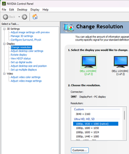 Oversampling
 -
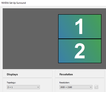 Combining displays


Models
The accepted method of capturing 3d models of characters and items is to take a screenshot of the in game 'examine' window, and key out the black background. The size of the window, and thereby the resolution of the final image, can be increased by saving the attached markup as Baldur's Gate 3/Data/Mods/MainUI/GUI/Pages/Examine.xaml[2]
Examine.xaml
<ls:UIWidget x:Name="Examine"
             xmlns="http://schemas.microsoft.com/winfx/2006/xaml/presentation"
             xmlns:x="http://schemas.microsoft.com/winfx/2006/xaml"
             xmlns:mc="http://schemas.openxmlformats.org/markup-compatibility/2006"
             xmlns:b="http://schemas.microsoft.com/xaml/behaviors"
             xmlns:ls="clr-namespace:ls;assembly=Code"
             xmlns:d="http://schemas.microsoft.com/expression/blend/2008"
             xmlns:noesis="clr-namespace:NoesisGUIExtensions;assembly=Noesis.GUI.Extensions"
             xmlns:System="clr-namespace:System;assembly=mscorlib"
             mc:Ignorable="d"
             d:DesignWidth="3840" d:DesignHeight="2160"
             ls:UIWidget.ContextName="Examine" d:DataContext="{d:DesignInstance {x:Type ls:DCExamine}, IsDesignTimeCreatable=True}"
             ls:TooltipExtender.Owner="{Binding CurrentPlayer.UIData.ExamineTarget}">

    <!-- ===== EXAMINE PANEL ===== -->
    <ls:UIWidget.Template>
        <ControlTemplate>
            <Grid x:Name="bgFade" Margin="0,0,0,0"> --
                <Grid x:Name="Panel" HorizontalAlignment="Center" VerticalAlignment="Top"
              DataContext="{Binding CurrentPlayer.UIData.ExamineTarget}"  RenderTransformOrigin="0.5,0.5" Margin="0,0,0,0">
                    <Grid.RenderTransform>
                        <TransformGroup>
                            <ScaleTransform/>
                            <SkewTransform/>
                            <RotateTransform/>
                            <TranslateTransform/>
                        </TransformGroup>
                    </Grid.RenderTransform>
                    <b:Interaction.Behaviors>
                        <ls:LSMouseDragElementBehavior HitArea="{Binding ElementName=DragHit,Mode=OneWay}"/>
                    </b:Interaction.Behaviors>
                    <ls:LSNineSliceImage x:Name="BGpanel" Style="{StaticResource Generic9SliceBG}" Width="3840" Height="2160">
                        <Grid>
                            <!--PAPERDOLL-->
                            <Grid HorizontalAlignment="Left" Margin="8,0,32,0" Background="Green">
                                <ls:LSPaperdoll x:Name="ExaminePaperdoll" EntityRef="{Binding EntityHandle}" Background="Green" Width="3840" Height="2160" UseCombatPose="True" MouseRotate="True" MouseRotateMultiplier="10" RenderScale="3"/>
                                <!--CONTROLS--><!--
                                <StackPanel Orientation="Horizontal" HorizontalAlignment="Center" VerticalAlignment="Bottom" Margin="0,0,0,60">
                                    <ls:LSButton  x:Name="rotateRightBtn" Template="{StaticResource RotateRightButton}">
                                        <b:Interaction.Triggers>
                                            <b:EventTrigger EventName="LSButtonPressed">
                                                <b:ChangePropertyAction PropertyName="RotationSpeed" Value="1.2" TargetName="ExaminePaperdoll" />
                                            </b:EventTrigger>
                                            <b:EventTrigger EventName="LSButtonReleased" >
                                                <b:ChangePropertyAction PropertyName="RotationSpeed" Value="0" TargetName="ExaminePaperdoll" />
                                            </b:EventTrigger>
                                        </b:Interaction.Triggers>
                                    </ls:LSButton>
                                    <ls:LSButton  x:Name="rotateLeftBtn" Template="{StaticResource RotateLeftButton}">
                                        <b:Interaction.Triggers>
                                            <b:EventTrigger EventName="LSButtonPressed" >
                                                <b:ChangePropertyAction PropertyName="RotationSpeed" Value="-1.2" TargetName="ExaminePaperdoll" />
                                            </b:EventTrigger>
                                            <b:EventTrigger EventName="LSButtonReleased" >
                                                <b:ChangePropertyAction PropertyName="RotationSpeed" Value="0" TargetName="ExaminePaperdoll" />
                                            </b:EventTrigger>
                                        </b:Interaction.Triggers>
                                    </ls:LSButton>
                                </StackPanel> -->
                            </Grid>
                            <!--FOR ITEMS-->
                            <ls:LSNineSliceImage x:Name="ItemInfoPanel" Style="{StaticResource WorldTooltip9Slice}" VerticalAlignment="Stretch" HorizontalAlignment="Right">
                                <StackPanel>
                                    <!--Hit Points-->
                                    <Control x:Name="HPBarContainer" HorizontalAlignment="Center" VerticalAlignment="Top" Margin="0,-28,0,-10" Template="{StaticResource TargetHealthBarTemplate}"
                                             Visibility="{Binding Stats.Health.Value, Converter={StaticResource CountToVisibilityConverter}, ConverterParameter=-1}"/>

                                    <ScrollViewer Style="{StaticResource NoForcedScrollViewerStyle}" Padding="{StaticResource ScrollOffset}" VerticalAlignment="Stretch" ClipToBounds="False" Margin="12,0">
                                        <StackPanel>
                                            <StackPanel.Resources>
                                                <ControlTemplate x:Key="DetailedEntry">
                                                    <ControlTemplate.Resources>
                                                        <Style TargetType="DockPanel">
                                                            <Setter Property="Margin" Value="8,0"/>
                                                        </Style>
                                                    </ControlTemplate.Resources>
                                                    <Border x:Name="entry" Style="{StaticResource RowBG_d}" MinHeight="48">
                                                        <ContentPresenter/>
                                                    </Border>
                                                    <ControlTemplate.Triggers>
                                                        <Trigger Property="IsMouseOver" Value="True">
                                                            <Setter TargetName="entry" Property="Background" Value="{StaticResource RowBG_h}"/>
                                                        </Trigger>
                                                    </ControlTemplate.Triggers>
                                                </ControlTemplate>
                                            </StackPanel.Resources>

                                            <ContentPresenter ls:TooltipExtender.Owner="{Binding DataContext.CurrentPlayer.SelectedCharacter, ElementName=Examine}" Content="{Binding .}" DataContext="{Binding .}" ContentTemplate="{StaticResource ItemsTooltip}" ls:TooltipExtender.IsOpen="True" ls:TooltipExtender.Content="{Binding .}" ls:TooltipExtender.PlayerId="{Binding Path=DataContext.CurrentPlayer.PlayerId, ElementName=Examine}" Margin="20"/>

                                            <!--Resistances-->
                                            <StackPanel Name="ResistancesSection" Visibility="{Binding Stats.NumActiveResistances, Converter={StaticResource CountToVisibilityConverter}}">
                                                <ContentControl Style="{StaticResource BaseTitleStyle}">
                                                    <TextBlock Text="{Binding Source='h98a4ccfbg20f4g4294g9bf7g624c95711539', Converter={StaticResource TranslatedStringConverter}}"/>
                                                </ContentControl>
                                                <Control x:Name="ResistanceContainer" HorizontalAlignment="Center" Template="{StaticResource ResistancesGridTemplate}"/>
                                            </StackPanel>
                                        </StackPanel>
                                    </ScrollViewer>
                                </StackPanel>

                            </ls:LSNineSliceImage>

                    <!--DRAG AREA-->
                            <Grid x:Name="DragHit" VerticalAlignment="Top" HorizontalAlignment="Stretch" Background="Transparent" Height="140">
                                <b:Interaction.Triggers>
                                    <b:EventTrigger EventName="MouseEnter">
                                        <b:InvokeCommandAction Command="{Binding DataContext.SetCursorCommand, RelativeSource={RelativeSource AncestorType={x:Type ls:UIWidget}}}" CommandParameter="Resize"/>
                                    </b:EventTrigger>
                                    <b:EventTrigger EventName="MouseLeave">
                                        <b:InvokeCommandAction Command="{Binding DataContext.SetCursorCommand, RelativeSource={RelativeSource AncestorType={x:Type ls:UIWidget}}}" CommandParameter=""/>
                                    </b:EventTrigger>
                                </b:Interaction.Triggers>
                            </Grid>
                            <!--CLOSE BUTTON-->
                            <ls:LSButton x:Name="CloseExamine" Style="{DynamicResource SmallCloseButton}" SoundID="UI_Shared_Cancel" HorizontalAlignment="Right" VerticalAlignment="Top" BoundEvent="UICancel" Margin="0,0,0,0">
                              <ls:LSButton.Triggers>
                                  <EventTrigger RoutedEvent="Button.Click">
                                      <BeginStoryboard x:Name="CloseAnimation" >
                                          <Storyboard Children="{StaticResource ClosePanelAnim}"/>
                                      </BeginStoryboard>
                                  </EventTrigger>
                              </ls:LSButton.Triggers>
                            </ls:LSButton>
                            <!-- ===== INFO PANEL ===== -->
                            <!--FOR CHARACTERS-->
                            <Control Name="CharacterInfoPanel" Template="{StaticResource CharSheetTabController}" Width="{StaticResource CSColumnWidth}" HorizontalAlignment="Right" VerticalAlignment="Bottom" Margin="0,8,8,8"/>

                        </Grid>
                    </ls:LSNineSliceImage>
                </Grid>

                <!--===== TRIGGERS & ANIMATIONS =====-->
                <b:Interaction.Triggers>
                    <b:StoryboardCompletedTrigger Storyboard="{Binding ElementName=CloseAnimation,Path=Storyboard}">
                        <b:InvokeCommandAction Command="{Binding CustomEvent}" CommandParameter="CloseWidget"/>
                    </b:StoryboardCompletedTrigger>
                </b:Interaction.Triggers>
                <Grid.Triggers>
                    <EventTrigger RoutedEvent="FrameworkElement.Loaded">
                        <BeginStoryboard Storyboard="{StaticResource OpenPanelAnim}" />
                    </EventTrigger>
                </Grid.Triggers>
            </Grid>

            <ControlTemplate.Triggers>
                <DataTrigger Binding="{Binding CurrentPlayer.UIData.ExamineTarget.Type}" Value="Item">
                    <Setter TargetName="CharacterInfoPanel" Property="Visibility" Value="Collapsed"/>
                    <!-- <Setter TargetName="BGpanel" Property="Width" Value="2000"/> -->

                </DataTrigger>
                <DataTrigger Binding="{Binding CurrentPlayer.UIData.ExamineTarget.Type}" Value="Character">
                    <Setter TargetName="ItemInfoPanel" Property="Visibility" Value="Collapsed"/>
                </DataTrigger>
            </ControlTemplate.Triggers>

        </ControlTemplate>
    </ls:UIWidget.Template>

    <b:Interaction.Triggers>
        <b:EventTrigger EventName="Loaded">
            <ls:LSPlaySound Sound="UI_HUD_Examine_Open"/>
        </b:EventTrigger>
    </b:Interaction.Triggers>

</ls:UIWidget>
Image layout and presentation
Character images
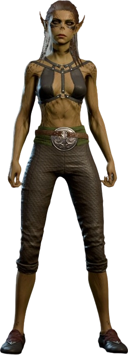
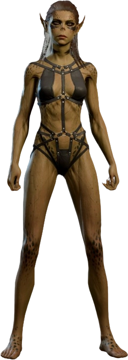
For character pages, whenever possible, include both a cinematic portrait/screenshot and a transparent full-body model of the character. Display the the model image first and then in-game images and official render or character art.
Make sure the {{PageSeo}} template (if present, in the process of being phased out on creature pages) has been invoked with the cinematic portrait as the image parameter. This will help ensure consistency across character pages and external link previews (e.g. social media sites and Discord).
Example Gallery for Lae'zel
-
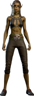 Camp clothing model
 -
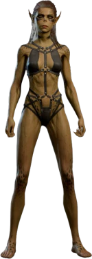 Underwear model
 -
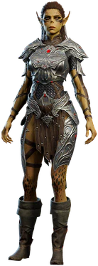 Early Access model
 -
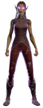 Astral projection model
 -
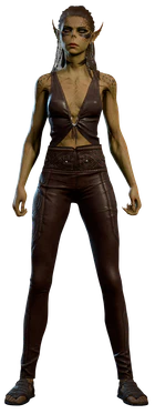 Alternate epilogue model
 -
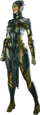 Digital Artbook concept
 -
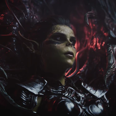 During the intro cinematic
 -
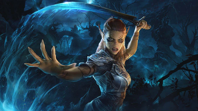 Steam Trading Card
 -
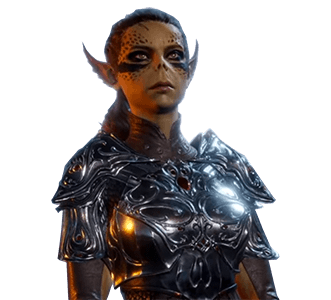 Appearance pre-release
 -
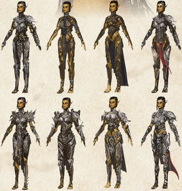 Digital Artbook armor concepts



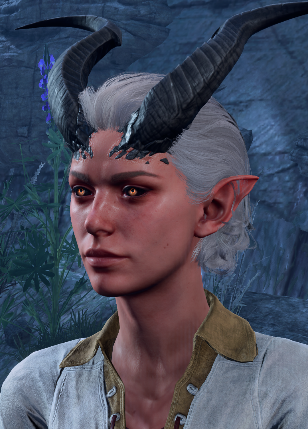
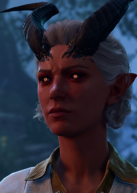
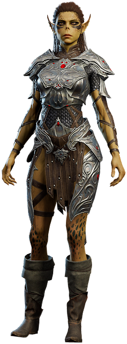
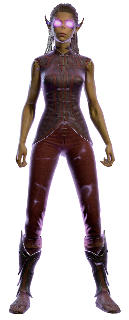
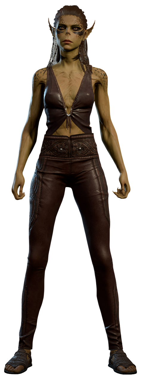
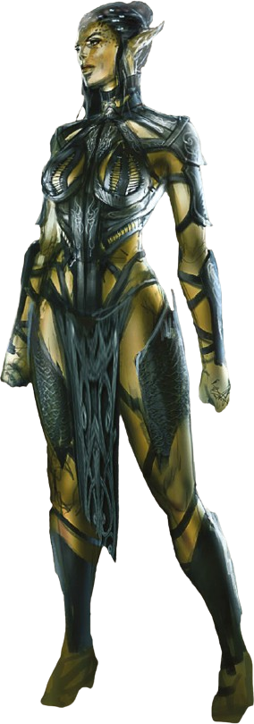
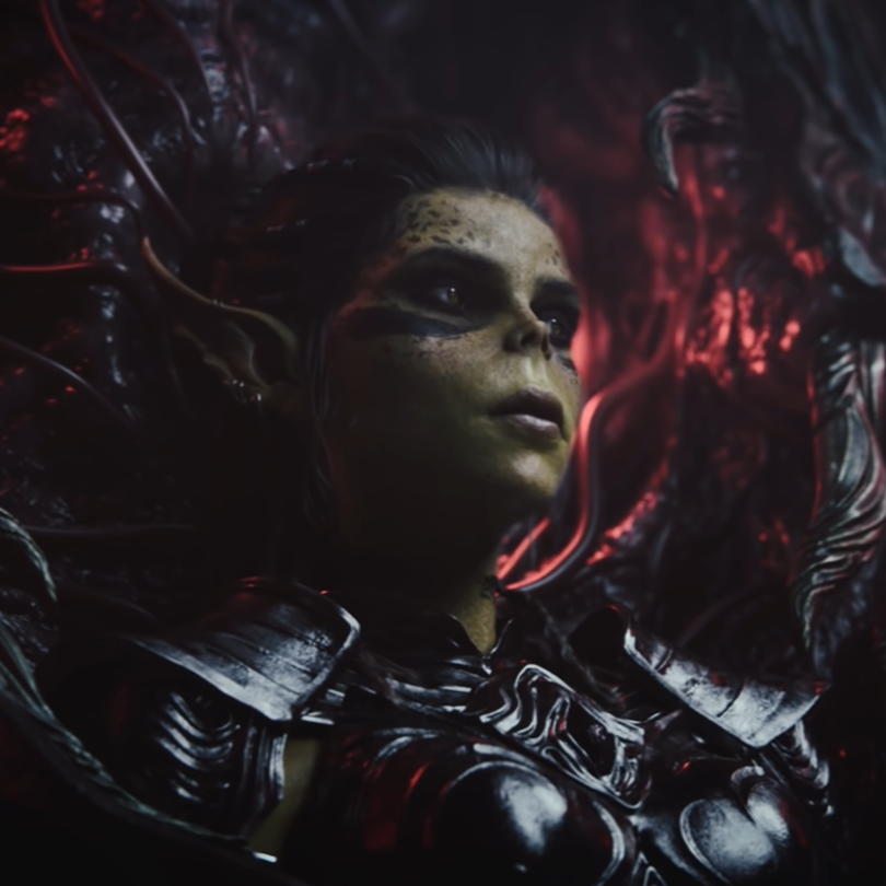
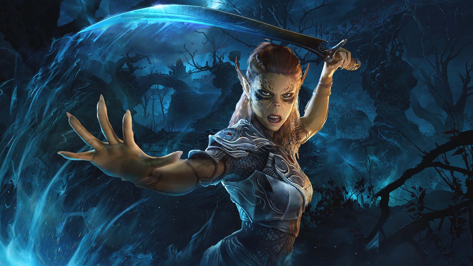
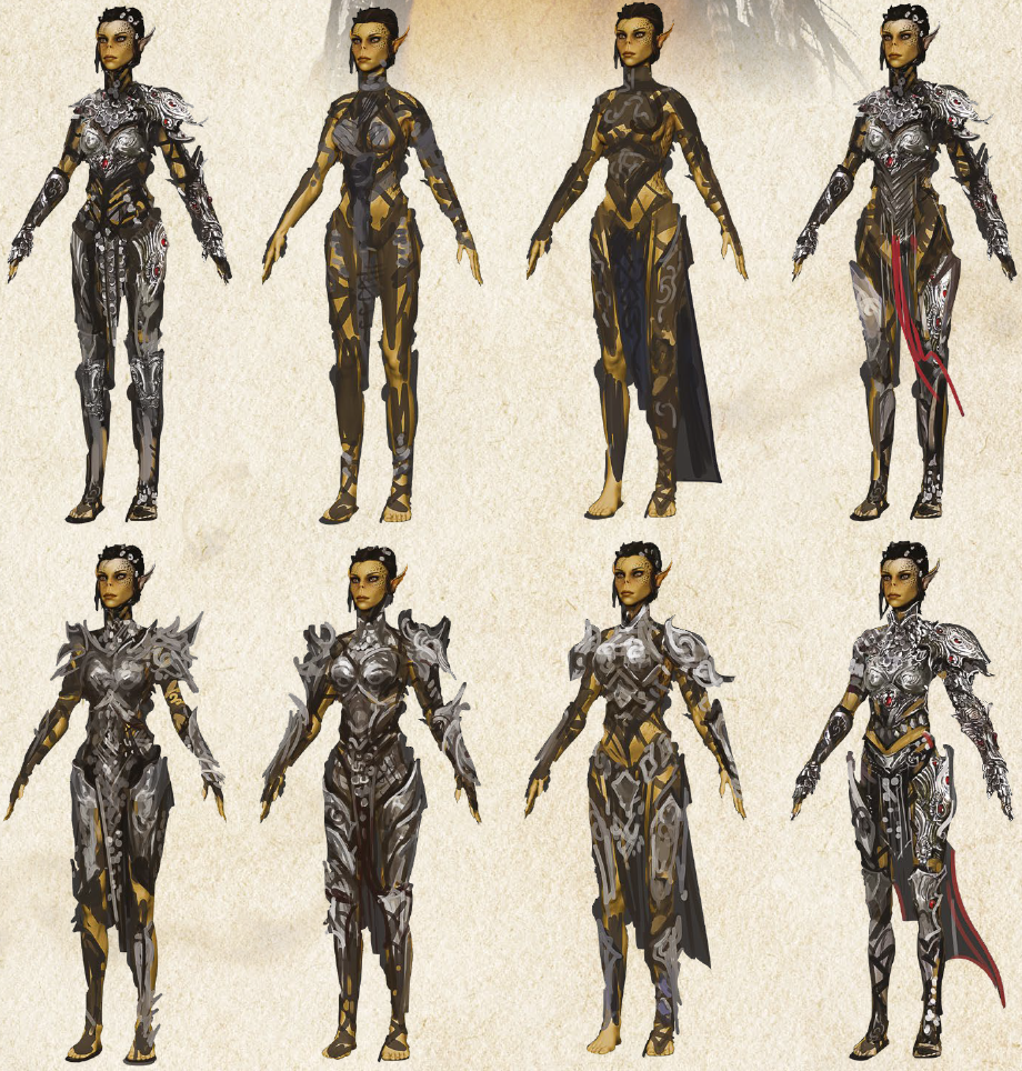
Note: Images from her infobox are not repeated in the gallery
Image alt text
When using the File template, alt text (text which appears when the image fails to load) should be added as necessary to improve accessibility. The text should be clear, concise and descriptive.
Alt text can be added to the File template with this parameter:
|alt=
Examples


- {{File:A_Nice_Summer_Stay.png|alt=Astarion flinching in pain after being hurt by concentrated sunlight at the Githyanki Créche.}}
- {{File:Gale_Flirting.png|alt=Gale is serenading Tav while sitting on Mystra's picnic blanket at Lake Hurricane.}}


- {{File:A_Nice_Summer_Stay.png|alt=Astarion discovering the difference between a nice Summer stay and the full concentrated power of the sun.}}
- {{File:Gale_Flirting.png|alt=Gale sings while sitting at lake.}}
Modded Content
In most cases, images containing modded content should be avoided to prevent confusion or misleading impressions. However, there may be some acceptable exceptions:
- Mods that improve camera angles – Images altered to provide better or different perspectives that enhance what is being depicted are generally acceptable.
- Minor presence of modded elements – If modded content appears only minimally or is incidental within the image (use discretion in determining what qualifies), it may be acceptable.
- Wherever possible, completely unmodded is preferable
Notes
- ↑ If convenient, capture them looking stage left and mirror the image after the fact. Note: For symmetrical models only. You shouldn't do this to Karlach and get her broken horn on the wrong side.
- ↑ Sourced from User:HiddenDragon in the wiki discord